Wednesday, 13 May 2020

EXP2 FINAL SUBMISSION: THE BRIDGE

Brief and Premise

Imagine you are the Dean of a school of Architecture or Engineering. Your school has 100 students who are drawn from all around the world and are supported by scholarships. Your challenge is to design a school that forms a bridge spanning buildings in an urban environment. The urban environment is the lower part of the "UNSW Sydney" Kensington campus; the central building is the Squarehouse (building E4 on this map). In addition, you will design two moving elements that modify the students view of the school when they see it from locations on the ground plane vs locations above ground level. These different points of view will reinforce or challenge your particular "Theory".

PREMISE: Environments change over time. Action and interaction within an environment provide a vehicle to synthesize information and make sense of continually shifting structures.


Theory


"Natural light through undulating structure affects spatiality, ambiance and typology of a designated location."
Carson Kwong

Brant, Julia. "6 Airport Interiors that Enhance Travelling Experience." Archdaily (2020). Translated by Amanda P. Almeida. Accessed on April 1, 2020.


Development Process

I have chosen to design a school of Architecture for students of 3 different years, meaning the size of the facilities only needs to attune to a group of approximately 30 - 40 students. My interpretation of the premise is that with the advance of technology, future architecture students have less need for physical lectures, yet studio work and workshop remains an integral part of their studies. 


Animated Drawing

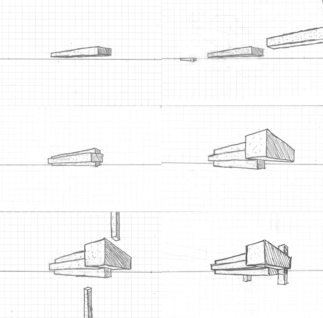
A two-point perspective gif.

An axonometric gif


The 6 key words are: Scalar, Rotational, Linear, Commute, Volume, and Time.


Final Outcome - SketchUp


The shape of the bridges is that of a twisted and alternating cube. I drew inspiration from rubric's cube, where I found a parallel between it, Drama, and Architecture - they all built upon simple conventions yet various representations stem from it. The theme is applied and embedded into the twisting structure to produce a sense of conventionality with the simple square shape, while also producing a sense of unorthodoxy with its twisted shapes.


The final outcome changed drastically from the initial concepts and plans, but it retained several key elements from it. The emphasis of a bulky span still exists, albeit splitting into 3 separate bridges. The idea of each level serving a type of user also morphed into each bridge serving a type of user. The bridge's curvature also enables maximum exposure to sunlight in both winter and summer for effective academic study. 


Final Outcome - Lumion

Animation Tour of the Bridge


Animation for the Moving Shade


Animation for the Moving Bridge Cover


Small vertical gardens are placed between the exterior spatial elements to enhance the ambiance of the central commuting space.


The main materials for the bridge would be reflective metal sheets, timber and glass. The reflective materials allow more light interaction and exposure with the users of the bridge.


The structure represents the theory on various levels. Firstly, the twisting bridge structure is indisputably undulating. 

Secondly, the encirclement of the central pedestrian bridge with the academic and student bridges greatly influences our perception of spatiality when traveling on the bridge. Moreover, when traveling on the student or academic bridge, the sense of spatiality is affected by the undulating structure as well as the light that passes through them. 

Thirdly, the massive glass panels at the northern student bridge offer a high degree of transparency and permeability, allowing more sunlight exposure towards its interiors and the other two bridges. The reflected and refracted lights, in addition to the direct beams from the sun and the vertical gardens, elevate the ambiance of the bridges with a level of warmth and gentleness. 

Fourthly, the typology of a bridge and a school of architecture refers to its stereotype. Hence the elevation of its ambiance and spatiality, in addition to the fact that a bridge is surrounded by a faculty building and a faculty building is on a bridge, imply that the bridge's light interaction has altered and integrated its typology.

Feedbacks form peers

Michelle Nguyen
David Ramos


 Lily Chen

Sunday, 26 April 2020

Full draft of outcomes

Theory:

Natural light through undulating structure affects spatiality, ambiance and typology of a designated location.


3 sketch perspective drawing:


36 custom textures :


2 animated drawings:


1 sketchUp model with 2 moving elements:

the vertical square is on top of NIDA, and it is joined by 3 distinct bridges from the squarehouse, which has an upgrade of two square boxes. The bridge to the left in the image is the academic bridge, its higher than the student bridge, hence minimum disruption from pedestrians. The bridge to the right is the studednt bridge, it is closer to the pedestrian bridge and it is larger than the academics bridge. The small simple pedestrian bridge at the centre is open-aired, so it is subject to light influence via the two other bridge, hence influencing spatiality, ambiance and typology of the pedestrian bridge. 


moving  elements:
moving shades that adjust to various sun positions (allow more/ less light)
moving bridge that connects student bridge to pedestrian bridge (when studio begin/ end)

How it relates to theory:
the twisitng cube structure is "undulating"

he small simple pedestrian bridge at the centre is open-aired, so it is subject to light influence via the two other bridge, hence influencing spatiality, ambiance and typology of the pedestrian bridge. 

some vertical gardens hanging from the exterior of the sides facing the pedestrian bridge? to change ambiance?


1 lumion environment:

refer to the real times image captures?
anyway heres a rough animation of the moving shades


5 real time image capture (NOTE: yellow is a placeholder colour)


(optional) 120 s animation:


Sunday, 19 April 2020

Week 9 Self directed learning

Axonometric gif of my design using 6 rectangular prism


Two point perspective Sketch on the design


Sunday, 12 April 2020

Week 8 work: Plans

Improved plans based on other plans

I have chosen the plan of Villa Marea by Alvar Aalto to improve upon as the plan for the bridge. The main change I made to the plan was moving the large living space to the right and treat it as the lecture hall. The leftmost and rightmost sides represent NIDA and Squarehouse respectively
1st level of the bridge

2nd level of the bridge

3rd level of the bridge

Reimagined Section

 By completing the frame in the plan of Villa Marea, I have created a square section that consists of three levels. This section represents one of the alternating square section across the span of the bridge.

Iteration 1 of the Bridge


The resultant model for the plans and section produced such a shape, in which its altering shape echoes with the nature of both the study of built environment and drama - the fact that they are ever-changing but clings to certain traditions and conventions. The simplistic square shape represents the basic conventions, while the twisting pattern showcases their changing nature.


Saturday, 11 April 2020

Research into the area context

The area around the Squarehouse

View of the Squarehouse across ANZAC Parade

Aerial View of the structures surrounding the squarehouse
Since my plan is to connect NIDA and the squarehouse, the bridge will need to cross ANZAC Parade. However, there are multiple large trees blocking such connections, which prevent the bridge from staying close to ground.


Images on NIDA and the squarehouse (credit to Charles Hung)

The bridge can connect to the empty space on the roof above the foyer of NIDA centre, while the bridge can connect to the third floor or the roof of the squarehouse to minimalise impact to vegetations. 


plan of the first floor of Squarehouse

plan of the secondfloor of Squarehouse

plan of the third floor of Squarehouse

 The blue circle in the plans of squarehouse indicate a suggestion to expand the staircase of the Squarehouse to accomodate for an influx of pedestrian movement of the bridge.

Seasonal Solar position

The angle of projection of the sun during winter

The angle of projection of the sun during summer